GIMP
News
Docs
Tutorials
More
Text and images Copyright (C) 2002 Eric R. Jeschke and may not be used without permission of the author.
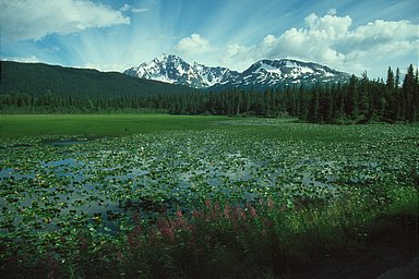
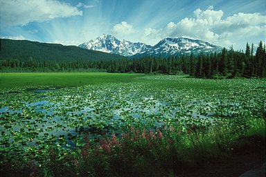
In this tutorial I’ll show you how to do gaussian blur overlays using GIMP. This is an interesting technique that intensifies and saturates the colors in the image, increases contrast, and adds a slightly hazy, “dreamy” feel to the image.
The basic technique is to create a duplicate layer in the image, lighten it and blur it, and combine it using a layer mode with the original.
Giving credit where credit is due: I did not come up with this method. I adapted it for GIMP from a Photoshop tutorial on the luminous-landscape.com web site (great photography web site BTW; I recommend it).
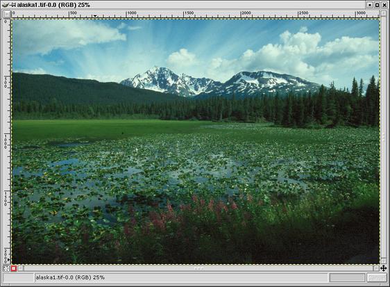
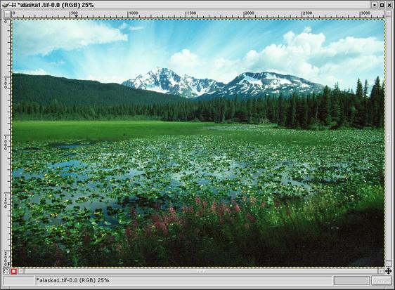
Here is the original example image, loaded into GIMP.
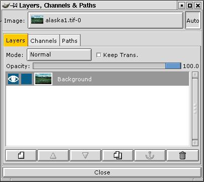
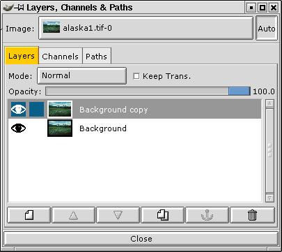
Open the Layers dialog (if it is not already open, it can be accessed through:  ).
).


Now double-click on the duplicate layer and rename the new layer “Blur Overlay”. This step is not strictly necessary, but it is helpful to prevent confusion about what is on each layer, especially if you add some additional layers for other editing purposes, or more importantly, if you save the file with layers and open it six months later.
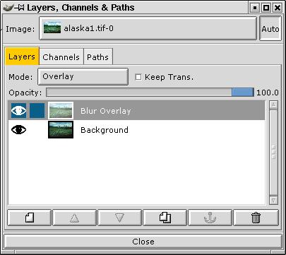
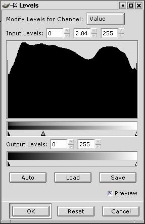
In the Layers dialog, select the Blur Overlay layer. In the “Mode” drop-down box, select “Overlay”.
Now go back to the image window and apply a Levels (
Tip: If you don’t get a good effect with Overlay mode, try Multiply mode (you can even change this while the Levels dialog is active).
Tip #2: while the Levels dialog is active you can toggle visibility of the upper layer to see the original image and compare to the blend. Just click on the “eye” next to the upper layer.
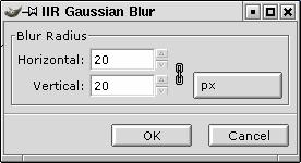
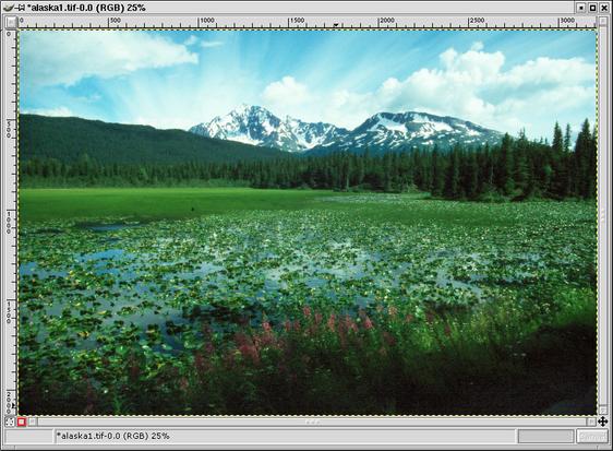
Go back to the image window and right click, selecting
Voila! If you don’t like the effect, you can undo the blur (Ctrl+Z) and redo it (Shift+Alt+F) with a different value.
Click on the “eye” next to the Blur Overlay layer in the Layers dialog to rapidly compare the image with and without the overlay. Similarly, turn off the Background layer if you want to view the overlay to do further work on it.
Although I like the effect, there is one problem with this technique and that is that it also increases contrast: the shadows get darker and the highlights get lighter.
You might be able to apply a contrast mask to counteract this effect, but in most cases it is the highlights that are the most troublesome in that they have lost detail. Fortunately we can apply a simple extension to the above technique to protect the highlights.

Duplicate the image (Ctrl+D).
Flatten the duplicate (
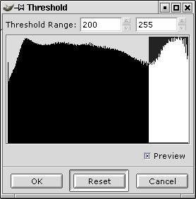
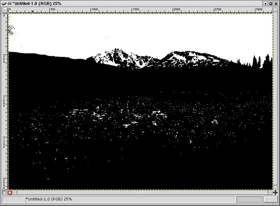
In the duplicate, run a threshold filter (
In the threshold histogram, click and drag to the right to select all the pixels at the upper end of the scale. Retry or adjust the selection using the number controls in the dialog box until the display shows most of the pixels you want to preserve as white and all the rest black.
You only need to approximate this, since we’re going to clean up the mask anyway.
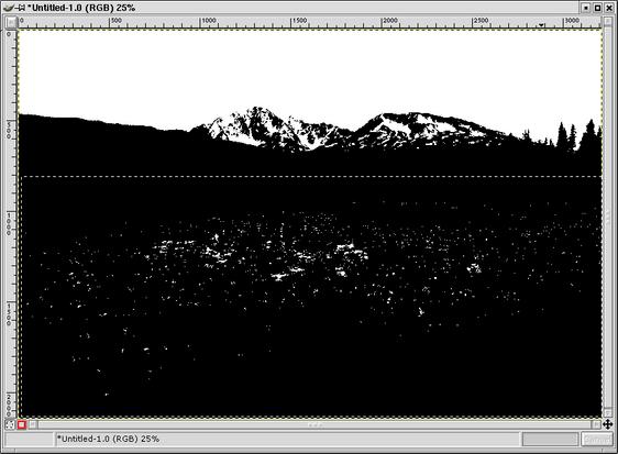
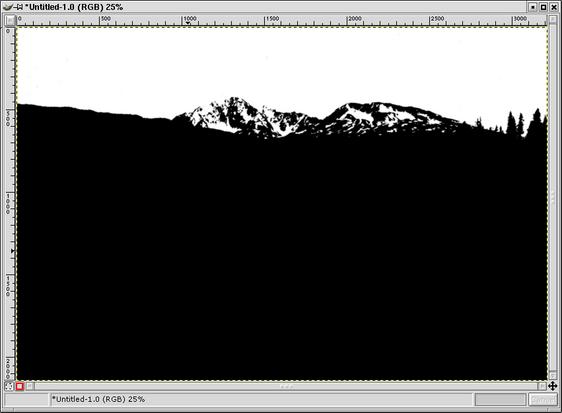
To clean up the mask, I switched to the paintbrush ( ), hit “x” in the mask image to switch the foreground and background colors (Black/White to White/Black), selected a nice opaque brush in the Brushes dialog and painted the few pixels of the sky white that hadn’t been turned white (the darkest parts of the clouds).
Now the black parts. I switched the fg/bg colors back to (Black/White). I could have painted black all over the lake, but I had a faster idea in mind. I used the marquee selection tool ( ) to select the whole area and then using the fill tool (
 ) I just clicked in the selection to fill it black in one fell swoop.
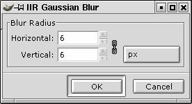
I then “feathered” the mask so that it will blend the layers without a harsh transition by applying a 6 pixel gaussian blur to the mask.
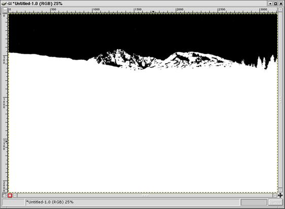
Invert the mask (
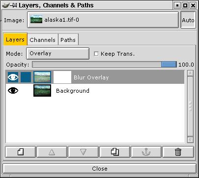
Go to the Layers dialog. Select the overlay blur image in the “Image” drop down box (if it is not selected already).
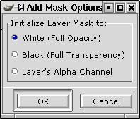
Right-click on the Blur Overlay layer and select Add Layer Mask. In the Add Mask Options dialog, select White (Full Opacity) and click OK.
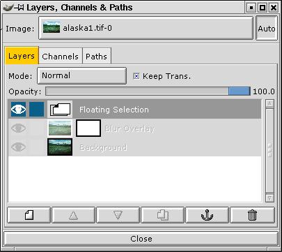
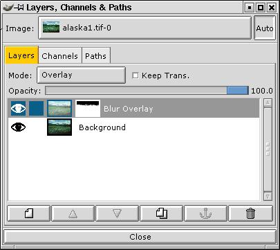
Now go back to the blurred threshold image, select all and copy (Ctrl+A then Ctrl+C). Go back to the overlay blur image and paste (Ctrl+V). Go to the Layers dialog and click the anchor button ( ) to anchor the mask.
Tip: Ctrl-click on the layer mask icon in the Layers dialog to toggle the effect of the layer mask to compare the image with and without the highlight mask.

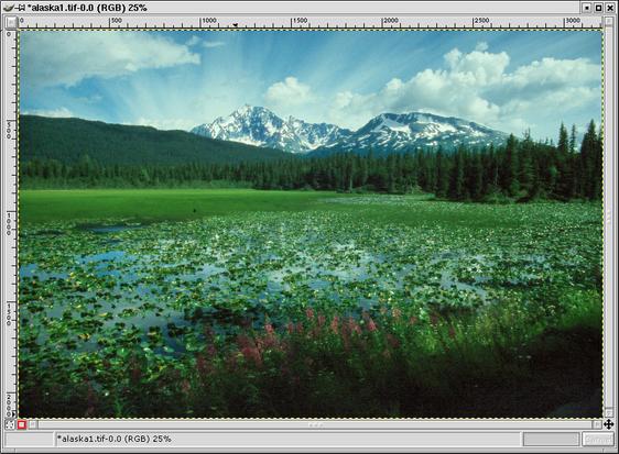
Here’s the result. Compare to the original image. I would flatten and apply a smart sharpening (edges) to finish it out.
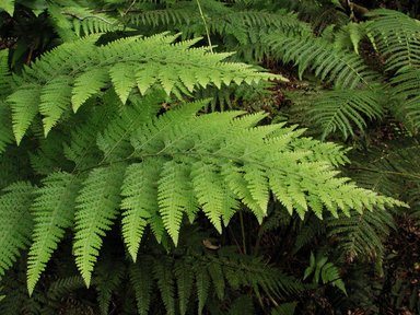
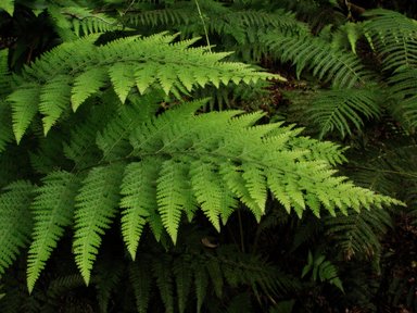
Using “Multiply” for the blending mode. (Final image on the right)
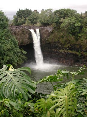
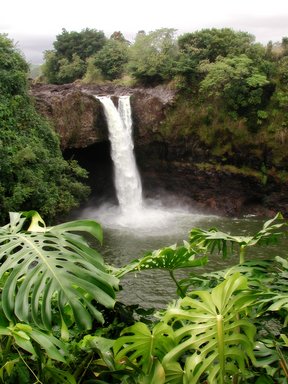
Using “Overlay” for the blending mode, plus a highlight mask for the sky and waterfall. (Final image on the right)
The original tutorial used to appear on gimpguru.